3 The theory
3.1 Types of data
Data can be qualitative or quantitative. Examples of qualitative data include
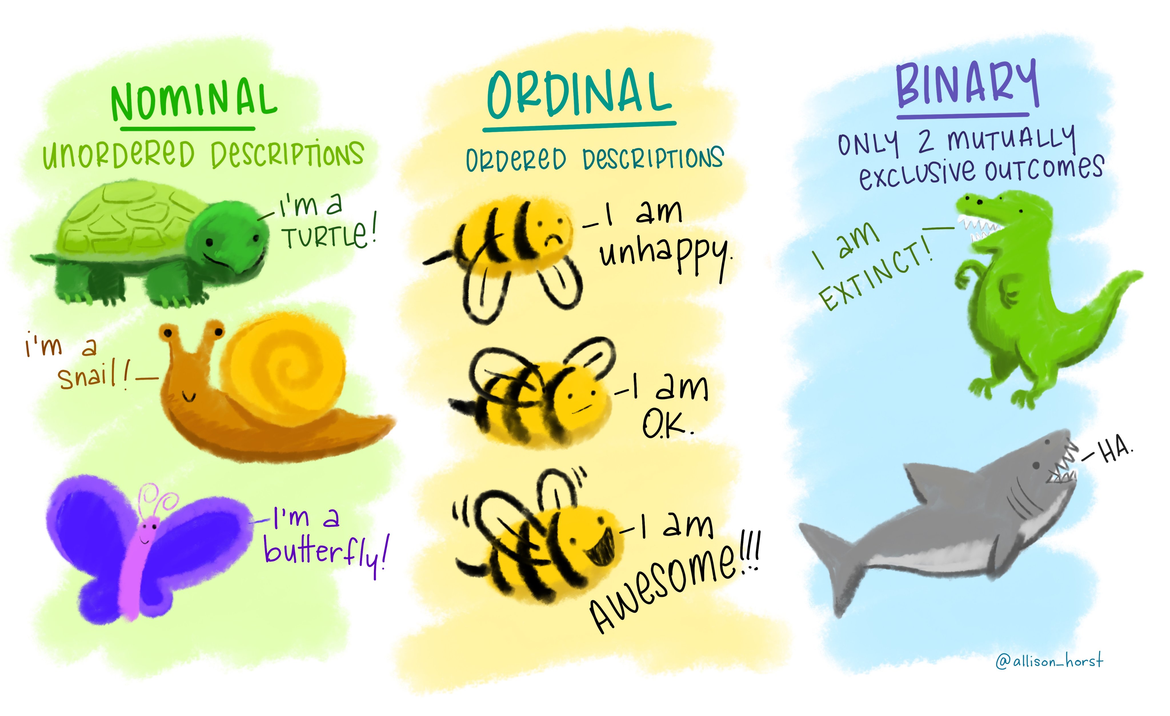
nominal: these are categories whose order does not matter, e.g., wild type, knockout, heterozygous, treated, untreated, young, old etc.
ordinal: these are categories where the order matters (i.e., ordered nominal). These are used in surveys (very good, good, bad, very bad), pain scales (1-5). happiness scales etc.
binary: where only two outcomes are possible, e.g., live or dead, wild type or genetically altered, infected or uninfected. In microbiological MIC (minimum inhibitory concentration) determination, we typically record growth/no growth endpoints at defined antibiotic concentrations; even though antibiotics are tested at 2-fold concentration gradients, the measured outcome is binary (resistant or sensitive based on antibiotic breakpoints).
These examples in Figure 3.1 from the beautiful art from Allison Horst makes the point very well!
Quantitative data can be discreet (integral, e.g. number of mice) or continuous (e.g. cytokine level in serum). Quantitative data can also be intervals (e.g. difference between two temperatures) and ratios (e.g. fold-changes, percentages). This book deals mainly with continuous variables and the normal or log-normal distributions. These are the kinds of data we collect in most laboratory experiments and are the focus of this document. I only cover analyses of quantitative data using parametric tests. I plan to add other kind of analyses in the future. Almost all parametric tests have their non-parametric variants or alternatives, which I don’t discuss here. If you use non-parametric tests, it may be more appropriate to plot data as median \(\pm\) IQR (because these tests are based on medians).
3.2 Probability distributions
A probability distribution is the theoretical or expected set of probabilities or likelihoods of all possible outcomes of a variable being measured. The sum of these values equals 1, i.e., the area under the probability distribution curve is 1. The smooth probability distribution curve is defined by an equation. It can also be depicted as bar graphs or histograms of the frequency (absolute number) of outcomes grouped into “bins” or categories/ranges for convenience. Just as data can be of different types, probability distributions that model them are also of different types.
Continuous variables that we come across in our experiments are often modelled on the normal distribution. But let us start with a simpler distribution – the binomial distribution – to understand the properties and uses of probability distributions in general.
3.2.1 Binomial distribution
Binomial distributions model variables with only 2 outcomes. The likelihood of one outcome versus the other can be expressed as a proportion of successes (e.g., in the case of a fair toss, the probability of getting a head is 0.5). Some examples in microbiology and immunology with binary outcomes include:
classification of bacterial strains resistant/sensitive based on antibiotic breakpoints
sensitivity to a host to a pathogen expressed as proportion of individuals that become infected versus those that remain uninfected
proportional reduction of infected cases after administration of an effective vaccine
mating of heterozygous mice carrying a wild type and knockout allele of a gene where we theoretically expect 25 % litter to be homozygous knockouts and 75 % to not be knockouts.
We use the framework of the binomial distribution to perform calculations and predictions when encountering such data, for planning experiments or answering questions such as: Is the proportion of resistant strains changing over time? Has the vaccine reduced the proportion of infected individuals? Does the loss of a gene affect the proportion of homozygous knockout pups that are born?
To understand the distribution of binomial outcomes, let us take a simple example of head/tail (H/T) outcome in the toss of a fair coin (probability of H or T = 0.5). This is an example where each outcome has an equal probability, but this is not a requirement for binomial outcomes. Let’s say we toss a coin 5 times, which would have 25 = 32 possible outcomes with combinations of H or T. We can plot a histogram of the probabilities of observing exactly 0, 1, 2, 3, 4 or 5 heads to draw the binomial distribution.
These likelihoods are plotted in the histogram shown in Figure 3.2. The X-axis shows every outcome in this experiment, which are also called quantiles of the distribution. The Y axis is the likelihood or probability – the area under the probability distribution curve adds up to 1. A binomial distribution is symmetric, and not surprisingly in this case, 2 or 3 heads are the most likely outcomes!
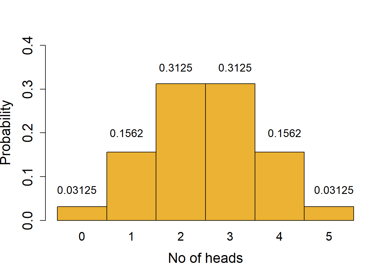
For example, there is only 1 combination that gives us exactly 0 heads (i.e., when all tosses give tails; likelihood of 1/32 = 0.03125) or 5 heads (likelihood 1/32 = 0.03125). More generally, the number of combinations in which exactly \(k\) heads are obtained in \(n\) tosses can be calculated with the formula nCk; we use this to get the probabilities of obtaining exactly 2, 3 or 4 heads. An important assumption that must be fulfilled is that the outcome of every toss is independent and does not influence the outcome of other tosses!
It is easy to see a couple of useful features of probability distributions:
Calculating the likelihood of combined outcomes: the probability of obtaining up to 2 heads is sum of probabilities of obtaining 0 or 1 or 2 heads = 0.03125 + 0.15625 + 0.3125 = 0.5. This is the area under the lower tail of the distribution up to the quantile 2. Because of the symmetry of the curve, the chance of obtaining more than 2 heads is the same as 1 - probability of up to 2 heads (1 - 0.5); this is the same as the area under the upper tail for the quantile 3 or higher.
Features of the tails of a distribution: the tails contain the less likely or rare outcomes or outliers of the distribution. For example, it is possible, but quite unlikely, to get 0 heads when you toss a coin 5 times. However, if you do get such an outcome, could you conclude that the coin may be biased, i.e., for that coin the chance of H/T is not 0.5?
The framework of probability distributions helps us define criteria that help answer these kinds of questions. But first we need to define the significance level (\(\alpha\)) at which we make an inference about the fairness of the coin. The \(\alpha\) threshold is typically set at 5 % in laboratory-based experiments.
With 5 coin tosses, we see that the chance of obtaining 0 or 5 heads is 0.03125 + 0.03215 = 0.0625 (6.25 % chance of 0 or 5 heads). From the distribution we see that values outside of the tails have a much higher probability; 1 - 0.0624 = 0.9375 or 93.75% chance. In other words, the quantiles of 0 and 5 mark the thresholds at 6.25 % significance cut-off (3.215 % equally in each tail). We could call our coin fair at this significance level if we observe between 1-4 heads in 5 tosses. This is a process we routinely use in null-hypothesis significance testing (NHST) – assume the null distribution and find outliers at a pre-defined significance threshold \(\alpha\).
As we will see in the section of power analysis, \(\alpha\) is also called the false-positive error rate – this is because we accept to falsely call 5 % values as outliers and reject that they belong to the current distribution even though they do.
3.2.2 Examples of binary outcomes
Let us now consider examples of binomial outcomes in microbiology and immunology.
3.2.2.1 Antibiotic resistance
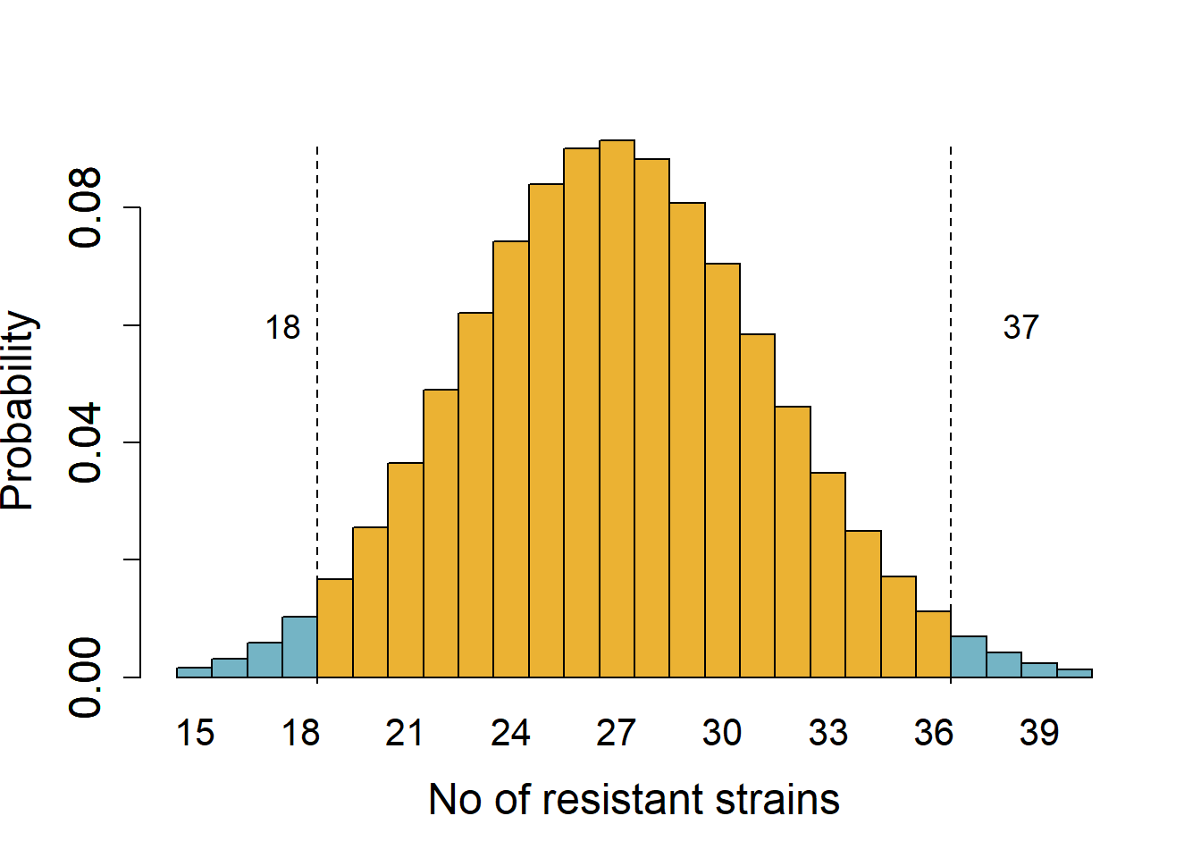
Consider results from surveillance that found 30 % strains of E. coli isolated at a hospital in 2020 were multi-drug resistant and the rest (70 %) were sensitive to antibiotics. This year, 38 out of 90 strains were multi-drug resistant. We want to know whether the rate of resistance has changed year-over-year at 5 % significance cut-off.
We start by assuming the rate is the same (the null hypothesis) – if the rate was the same, we expect 27 resistant strains (30 % of 90). This is a two-tailed hypothesis that the proportion of resistant strains could increase or decrease from 30 %. The critical quantiles at 5 % significance for a binomial distribution of a size 90 and expected proportion of resistant strains 0.3 are 19 and 36 (obtained with the qbinom function in R). Figure 3.3 shows areas in the tails (0.025 probability each) marking a value one less than the critical values.
We note that the quantile 38 is in the tail of the null distribution at \(\alpha\) 0.05, i.e., it is below the 5 % cut-off if the true proportion is 30 %. We could therefore reject the hypothesis that the proportion of resistant strains is 30 % at a significance cut-off of 5 %. This is how tails of distributions are useful in drawing statistical inferences based on null distributions and pre-defined thresholds.
3.2.2.2 Mating of heterozygous mice
Next consider this mating question we may encounter in immunology: when mice heterozygous for a new allele of a gene are mated (\({A/a}\)) we expect 25 % of the litter to be homozygous for the new allele (\(a/a\)) if the allele has no developmental effects and they segregate independently. In a breeding of heterozygous mice (\({A/a}\) x \({A/a}\)) we had 7 homozygous (\(a/a\)) animals out a total of 58 litter. Can you conclude the allele \(a\) has an impact on the expected number of pups? In this case, we have a one-tailed hypothesis that there are fewer than 25 % homozygous pups. Assuming a binomial distribution of size 58 and expected rate of 0.25 (~14 pups), the critical value in the lower tail is 9 at \(\alpha\) 0.05 (from qbinom). As 7 is less than this quantile, we could reject the null hypothesis that the observed proportion of \(a/a\) mice is 25 % at the 5 % significance threshold.
Just like we used the framework of binomial probability distributions to make an inference, in sections below we will discuss other distributions, but the principles remain similar.
Distributions in R
The thresholds (quantiles) for binomial distributions are obtained in R using the function qbinom, and the related functions qbeta (from the beta distribution), qnorm (normal distribution), and qt (t distribution). The inverse, i.e., finding the area under the curve up to a given quantile, is done with corresponding functions: pbinom, pbeta, pnorm, pt.
3.3 The normal distribution
The smooth ideal normal distribution – also called the Gaussian distribution – of probability densities is defined by an equation that we (thankfully!) rarely encounter (you can find the equation here). The mean and standard deviation (SD) are the parameters of the normal distribution that determine its properties. Statistical tests that depend on these parameters of our data (mean and SD) utilise features of the normal distribution we discuss below, and are called parametric tests!
The equation of the normal probability distribution does not take into account number of observations – it is an ideal smooth curve of likelihoods of all possible outcomes assuming a large number of observations (this is analogous to the theoretical chance of H or T in a toss of a fair coin is 0.5; in reality, this is can be measured only when a coin is tossed many many times).
Therefore a corollary is that, SEM (standard error of mean), which takes into account sample size is not a parameter of a distribution. Let’s first start with a microbiology example to dig deeper into the normal distribution.
The ideal normal distribution is perfectly symmetric around the mean (which is also its median and mode) and its shape is determined by the standard deviation. Most likely values of the variable are distributed near the mean, less likely values are further away and the least likely values are in the tails.
Parametric tests
In general, parametric tests are robust and perform well even when dealing with approximately normal distribution, which is more common in the real world. These are generally more powerful than their non-parametric counterparts.
3.3.1 The E. coli doubling time example
I’ll use a simple microbiology experiment – finding the doubling time (also called generation time) of Escherichia coli – to illustrate how by knowing just the mean and SD and using the equation of the normal probability distribution we can predict the likelihood of observing any range of theoretical values of this population. This theoretical population can be imagined as the doubling time from all E. coli that ever lived – for this example, we will assume the doubling time in Luria broth is exactly 20 min with an SD of exactly 2 min. In the real-world, we will never actually know these parameters for the population of all E. coli. This is often also the case for many variables we measure in the laboratory! For the sake of satisfying the normal distribution, below I provide an example of 5000 simulated doubling times (a fairly large number of observations – note that large clinical trials can include thousands of individuals!).
The graph on top in Figure 3.4 shows 5000 doubling times of our population of E. coli. The histogram of frequency distribution on the Y axis and bins (not labelled) of doubling times on the X axis (graph in the middle) reveals the central tendency of the population. The graph at the bottom is a smooth fit to the perfect normal distribution.
Most values of the doubling time are near the mean of 20 min (the most frequent or most likely observation), but we do have outliers in the tails. Just as in the simple case of the binomial distribution we discussed above, the probability or P values for a range of doubling times on the X axis are calculated as the area under the curve, for example, the probability of observing doubling times up to 15 min or higher than 25 min.

Parameters of a distribution
By knowing (just) the mean and SD, the shape of the probability distribution of sample means can be plotted using an equation. These two numbers are the parameters of the distribution, and tests based on related distributions are called parametric tests.
The normal distribution has key features that are useful for comparison and predictions: ~68 % of all values are within \(\pm\) 1SD of the mean, ~95 % within \(\pm\) 2SD and ~99.7 % are within \(\pm\) 3SD of the mean. In other words, the random chance of observing values beyond ~2SD in any normal distribution is 5 in 100 or 0.05 (it is easier to remember 2SD, more accurately it is actually \(\pm\) 1.96SD). These ranges are annotated on our E. coli doubling time population in Figure 3.5 below. For our population of doubling times, ~2SD = 4, so 95 % values are between ~16-24 min, and 5 % are outside this range. Because of perfect symmetry of the distribution, about 2.5 % values are < 16 min and 2.5 % are > 24 min. If a variable is normally distributed, or approximately/nearly normally distributed, we can assume this about its distribution as well. This is how we can apply the features of a perfect normal distribution to measured variables so long as they are not too far skewed from a normal distribution.

So, values at least as low as 16 or lower have a likelihood of 0.025 (area under the lower tail), and values at least as high as 24 and higher have a likelihood of 0.025 (area under the higher tail). Here, 16 and 24 are the critical values at 5 % \(\alpha\) threshold. The probability of doubling times at least as extreme as \(\pm\) ~2SD is 2 x 0.025 = 0.05 (two-tailed).
Values within ~$$2SD
By convention, 5 % samples that lie outside the \(\pm\) ~2SD range are considered ‘outliers’ of the population – this is the conventional significance level or \(\alpha\) threshold.
This property of distributions and the likelihood of rare values, i.e., values that are in the “tails” of the distribution, are the bases for statistical inferences.
We can also choose to be more stringent and consider 1 % samples (outside the ~\(\pm\) 3SD range) as outliers – \(\alpha\) of 0.05 is not a rule, it is just a convention.
3.3.2 Sample (experimental) means
In the above section we were discussing the mean and SD of the population of all E. coli. But in reality, we will never know these parameters for E. coli doubling times (or any other quantitative value in general). The experiments we perform in the laboratory to obtain the doubling times are samples from the theoretical population of E. coli. Our goal is to obtain representative, accurate and independent samples to describe the true population parameters. Therefore, in statistical terminology, experimental data we collect give us the sampling distributions rather than population distributions. Well-designed experiments executed with accuracy will give us values of double times – these are sample means which we hope are close to the true population mean (i.e., ~20 min) and SD (~2 min).
To reiterate, we will never know the true doubling time of all E. coli ever grown in laboratory conditions (or any other variable we are measuring) – we can only estimate it by performing experiments that sample the population and are truly representative of the population! The principles of distributions of samples will apply to our experimental data. Sample sizes determine experimental reproducibility, which we discuss in the section on power analysis.
Here is another way to think of the example of experiments and samples: let’s imagine that numbers corresponding to all doubling times of the population are written on balls and put in a big bag from which you draw independent, accurate and representative balls – the number of balls drawn is the sample size \(n\). If you draw 3 balls from the bag, this is similar to performing \(n\) = 3 statistically independent, accurate, representative experiments on different days with new sources of bacterial cultures. Typically, we perform experiments with technical replicates within each experiment to account for experimental mistakes. Those replicates are not independent samples from the population (more on technical and statistically independent replicates later on in this Chapter). Technical replicates can be thought of as drawing a ball and reading the number on it three times, just to be sure of it (may be with different sets of prescriptions glasses!) – the re-read numbers are not independent samples of the population.
Statistical methods based on principles of the normal distribution above can help answer the questions on probabilities, such as:
What is the likelihood that the three numbers you draw have a mean and SD same as those of the population?
What is the chance of drawing numbers at least as extreme as 10 or 30 min (~5SD away)?
What could you infer if independent \(n=3\) draws give you a sample mean of 30 and SD of 2?
If 10 different students also drew \(n=3\) independent samples, will they get the same result as you?
Should your sample size be larger than 3?
Note
It is often impossible to know the mean and SD of the entire population. We carry out experiments to find these parameters by drawing random, representative, independent samples from the population.
3.3.3 Real-world example of sample means
In this section I want to demonstrate the variability arising from the underlying mathematics of probabilities that affect sampling (i.e., experiments), and how this affects reproducibility and accuracy of our findings.
Let’s say a student measures E. coli doubling times on 3 separate occasions, i.e., statistically independent, accurate, representative experiments using different batches of E. coli cultures performed on three separate days. This is an ideal student – someone with perfect accuracy in measurements and does not make mistakes (here we only want to account for randomness from underlying variability inherent in the variable – doubling time and its mean and SD – we are measuring; we will ignore operator/experimenter or instrumental inaccuracies). Let’s also say that 9 more ideal students also perform \(n=3\) independent experiments and measure doubling times. For clarity, let’s call each student’s \(n=3\) experiments a “study”, so that we now have a total of 10 studies. Such an example is useful because it lets us discuss independent sampling and reproducibility of results of experiments performed \(n = 3\) times each by different scientists around the world.
From the “drawing balls from a bag” analogy, each of the 10 students will draw 3 independent numbers from the big bag containing the population of doubling times. We expect all 10 studies to find the true mean of 20 min and SD of 2 min. Let’s see if this actually happens in our simulations!
The results of \(n\) = 3 experiments each by 10 ideal students are shown in in Figure 3.6. (Such simulations are possible in R using the function rnorm , which generates random numbers from a distribution of a given mean and SD). The results are plotted as the 3 sample values (circles), their sampling mean (square) with error bars representing the 2SD range of sampling distribution; the horizontal line at 20 min is the expected population mean. Recall that in a normal distribution, 95 out of 100 values are within \(\pm\) 1.96 x SD, and only 5 of 100 samples would be outlier values. We expect that the true mean of 20 min is within ~1.96 x SD range of our sampling SD. In our simulated example, this happened only in 8 out of 10 students’ experiments!

What is also evident is the large variability in the 2SD intervals. This was not because our students performed experiments badly or made inaccurate measurements - this happened because of the underlying mathematics of probabilities and sample sizes. Unlike this ideal scenario, laboratory-based variability from inaccuracies in measurements will add more uncertainty to our sample (experimental) means & SD.
This example illustrates that the lack of reproducibility can occur even without operator error because of the small sample size and large noise (SD).
As you might have guessed, the 10 students might have had similar means and SDs if they had performed more than \(n=3\) experiments (i.e., drawn more number of independent and accurate samples from the population). The relation between number of experiments and reproducibility is the basis of statistical power analysis.
3.3.4 Independent sampling
In statistics “independent sampling” or “independent experiments” are mathematical concepts. We often say ‘biologically independent’ but do not fully appreciate what we actually need when performing experiments.
Let’s take an example of a clinical study testing a new drug. There are several instances where two individuals in a study may not be representative independent units of the population (e.g., all humans for whom the study results should apply).
The example of election polling is perhaps easiest to illustrate the importance of accurate, representative, independent sampling. Polling surveys for voting intentions should only include people from different groups, communities, cities etc. at proportions that reflect the the voting intentions of the whole country, otherwise surveys will be biased and their predictions will be inaccurate. In other words, the survey will not represent the true population.
What about clinical experiments involving human participants or laboratory experiments with mice? Two different individuals may be considered biologically different or distinct, but if these individuals are too similar to each other (e.g. similar age, sex, bodyweight, ethnicity, race, diets etc.) they may not be representative samples of the whole population. Similarly, inbred mice sourced from the same company, housed together in a cage, fed the same chow, water etc. may not necessarily be independent experimental units in every kind of experimental design.
In tissue culture-based experiments, replicate wells in a multi-well tissue culture plate containing the a cell line passaged from the same culture dish may be biologically different wells but not independent in most experimental scenarios.
The independence of observations/measurements we make is very important and you must be careful to recognise truly independent measurements and technical replicates in your experiments (see section on technical and biological replicates below).
Based on the “polling” example, two flasks of LB inoculated from the same pre-inoculum of E. coli and measured on the same day will not be statistically independent – these two flasks would be “individuals from the same household” or “too similar to each other” to represent the true population.
To summarise, most experiments we perform in the laboratory are samples drawn from a hypothetical ideal population. We must ensure our experiments give us independent, representative, and accurate samples from the population. For statistical comparisons, even though we typically think of two individuals as biologically different or distinct or independent, what we need are samples that are truly independent and representative.
3.4 Other distributions - \(z\), t, F
Everything we discussed above related to the mean and SD, and likelihood of outliers, of a single parameter we are interested in, e.g., the doubling time of a strain of E. coli. However, in general, we are interested in comparing groups, e.g., using Student’s t tests or ANOVAs. For parametric tests, which are generally more powerful, we rely on the same principle of probability distributions. The main difference is that we will first calculate a test statistic from our data, and assess whether this statistic is an outlier of the null distribution.
We will consider three test statistics and their distributions:
\(z\) (related to the normal distribution): the \(z\) distribution is a variant of the normal distribution. It assumes a large number of observations \(N\) and its shape does not change with sample size.
t : this is a family of distributions used for Student’s t test for various sample sizes \(n\). It is symmetric with a mean of 0 (which is the null hypothesis). These are used to infer the probability of observing a value at least as extreme for the t statistic calculated from data, assuming the null hypothesis is true.
F : these are a larger family of distributions used in ANOVA based on variances. F values are therefore always positive.
3.4.1 \(z\) distribution
The \(z\) distribution is a standardised normal distribution. Calculating the \(z\) score is a method of normalisation that converts the probability density curve of raw data with a given mean and SD into a standardised curve with a \(mean = 0\) and \(SD = 1\). The main benefit is that this converts observed data into unitless scores that are easier for comparisons between variables.
For a given data set, \(z = \frac{(x - mean)}{SD}\) ; \(x\) represents every single value of a large data set whose overall \(mean\) and \(SD\) are used to calculate a \(z\) score for each \(x\). The scale function in R generates \(z\) scores. This way, each \(x\) in the data is assigned a \(z\) score.
By subtracting the overall mean from all values and dividing by the SD we get a \(signal/noise\) ratio. The numerator is the \(signal\), which is the difference between a value \(x\) and from the overall mean. The denominator is the \(noise\), which is the SD. Properties of the normal distribution apply to \(z\) distributions: 95 % \(z\) scores are within \(\pm1.96\)x\(SD\). Because the \(z\) distribution has a mean = 0 and SD = 1, 95 % \(z\) scores are within \(\pm1.96\) (or approx. \(\pm2\)). In other words, the critical values for a \(z\) distribution at 5 % cut-off are \(\pm1.96\). So \(z\) scores greater or smaller than \(\pm1.96\) are in the tails of the \(z\) distribution at an \(\alpha\) of 0.05, which is easy to remember! Outliers of the distribution are those \(x\) with a \(z\) score outside \(\pm 1.96\).
We can generate a standardised distribution of the population of E. coli doubling times by subtracting the mean (20 min) from each value in Figure 3.4 and dividing it by SD (2 min). This is shown in Figure 3.7. These \(z\) scores for the observed doubling times are normally distributed around \(mean = 0\) and \(SD = 1\). The approx. 2SD range (16 and 24, as in Figure 3.5) give us \(z\) scores of approx. \(\pm2\) (or more accurately \(\pm1.96\)).

3.4.1.1 Applications of \(z\) scores
Assumptions of the \(z\) distribution will apply to real-world normally distributed data with a large sample size, such as genome-wide CRISPR/Cas9 or RNA interference screens, drug-screens with large libraries of compounds, and many other high-throughput studies. The idea is that in such screens, most values will near the mean (i.e., most genes in a genome-wide screen are unlikely to affect the phenotype we are measuring), and values with \(z\) outside the critical values are ‘hits’.
If we use a library of mutants of every gene in E. coli and measure their doubling times (e.g. in a high-throughput plate-reader assay), we will have lots of independent values for each mutant strain that we want to compare with the wild-type strain. We can calculate \(z\) scores for each strain by obtaining a \(mean\) and \(SD\) from the entire set of observations. Most genes are unlikely to affect doubling times and will have \(z\) scores that are more likely near 0. But some genes that do affect doubling times would have extreme \(z\) scores away from 0. At 95 % significance cut-off, the critical values are \(\pm1.96\), beyond which we may find outliers of the population. These could be the genes we would investigate further!
Another advantage of using \(z\) score in large-scale screens is that when comparing these values we do not need to rely on P values or adjust for multiple comparisons – very high or low \(z\) scores are indicative of how unlikely our observation is if the null hypothesis is true (i.e., the mean \(z\) score for the population is 0). A \(z\) score is sufficient to infer a “significant difference” from the mean and identify outliers.
A variant of \(z\) scores uses median and median absolute deviation (MAD) instead of mean and SD is often used in screens. This is called the robust \(z\) score (\(\overline{z}\)). Remember that outliers in data can bias the value of the overall mean and SD, but the median (middle value or the 50th percentile value) is not affected by extreme values. Therefore robust methods are often useful while calculating an unbiased overall average and scatter when there are many outliers (indeed, most screens use the robust counterpart, i.e., \(\overline{z}\) scores).
3.4.2 Degrees of freedom (Df)
The distributions we’ve encountered so far assume a large sample size. We next consider two distributions that take sample and group sizes in account (the t and F distributions). To understand these, we need to first know about degrees of freedom (Df).
Df is the number of theoretical values a variable can take depending on the sample size and number of parameters you wish to estimate from that sample. The easiest example is of finding a mean from 10 samples – once 9 numbers and the mean are fixed, the 10 th number is already fixed and cannot be freely chosen – so the Df is 9, or sample size – 1 = 10 – 1 = 9.
When comparing groups, e.g., Student’s t test, you would subtract 1 from the sample size in each group, or total sample size – 2. More generally, Df = number of samples (\(n\)) – number of groups (\(k\)) = 6 – 2 = 4.
Df are easy to understand for simple situations, but things can get complicated really quickly. Complicated enough that for ANOVAs with different numbers of samples in different group Df calculations are approximate.
The reason Df are important is that they determine which family of distributions are looked up by t and F tests, and this is central to finding whether the statistic is an outlier at a given significance threshold. As a side note, this is also why the t and F values and the Df from the test are more important to note than just the P value (see extreme values).
Do not include technical replicates for statistical comparisons as they artificially inflate the degrees of freedom and cause software to look up the wrong distribution. Also see the section below on pseudo-replicates to avoid this mistake.
This tutorial and this description on the Prism website are great. If you are interested in more lengthy discussions on Df, look here and here.
3.4.3 t distributions
When performing a Student’s t test on two groups, we calculate a t statistic from the data and ask: if the group means were the same, what is the likelihood of obtaining a t statistic at least as extreme as the one we hvae calculated?
There are some similarities between the t and \(z\) scores. Like the \(z\) score, the t statistic is a \(signal/noise\) ratio, where the numerator is the difference between the group means (\(signal\)) and the denominator is the pooled SD (\(noise\)). The t distribution is also a symmetric bell curve with a centre at 0.
The difference between the t and \(z\) distributions is that the shape of a t distribution depends on the sample size; more accurately, the degrees of freedom (Df). The t distribution takes sample size into account and is more conservative than the normal or \(z\) distributions. As sample size increases, the shape of the t distribution approaches that of the \(z\) distribution. This means that t distributions have longer tails and 95 % of values are more ‘spread out’ than in the case of the \(z\) or normal distributions. Therefore, the critical values at 5 % cut-off are more extreme than \(\pm1.96\), and they change based on the sample size of our experiments! The area under the curve gives us P values or the probability of obtaining a t statistic as extreme as the one we calculated from our data.
Let’s go through the above in the case of the doubling time experiment: let’s say you want to compare the doubling times of two strains of E. coli - the wild type (\(WT\)) strain and an isogenic \(\Delta mfg\) mutant lacking My-Favourite-Gene. We have experimentally measured the doubling time of both strains five times independently (\(n = 5\) times), we will have a total of just 10 values for the two groups and degrees of freedom (Df) = \(n\) - \(k\) = 10 – 2 = 8 . We will therefore look up a t distribution with 8 Df to decide the critical values at 5 % significance threshold. These happen to be \(\pm 2.3\) (we can get this from the qt function in R). Note that these are more extreme than \(\pm1.96\) of the \(z\) distribution. If the null hypothesis is true, i.e., the means of the two groups are the same and the expected value of the t statistic is 0; if our calculated t statistic lies outside \(\pm2.3\), the chance of observing that will be less than 0.05 (i.e., P < 0.05). You could say that we have been ‘penalised’ for the small sample size in our experiment and our critical values for an experiment of \(n = 5\) are more extreme than those for a \(z\) distribution!
t distributions
The shape of the t distribution approaches the \(z\) distribution for large \(n\). It is more conservative when the number of observations is small. This means that critical values at \(\alpha\) of 0.05 will typically be larger than the \(\pm1.96\).
3.4.3.1 Student’s t test
Having seen how the principle of a distribution and extreme values is used, let’s briefly go through the principles of a Student’s t test and how a t statistic is calculated – no complicated formulae below, just a description in lay terms.
The Student’s t test is used to compare the means of exactly two groups (for more than 2 groups, we must use ANOVA). The null hypothesis (\(H_0\)) of the Student’s t test is that there is no difference in the two groups being compared; in our case of the doubling times, the null hypothesis is that the difference between the mean doubling time of the two strains is 0 (\(mean_{wt} - mean_{\Delta mfg} = 0\); this also means that the expected tstatistic is 0). The two-tailed alternative hypothesis (\(H_1\)) is that the means are not the same (one can be larger or smaller than the other).
The t test calculates the difference between two means (the \(signal\)) and divides it by the pooled SD normalised to the sample size (weighted average based on sample size) of the two groups (the \(noise\)). If the two strains have the same means, the difference will be 0 (no \(signal\) and a t value of 0) – this is the most likely outcome if the null hypothesis is true. If the means are different, but the pooled SD is large (large \(noise\)), the t value will still be small and close to 0.
On the other hand, if the means of the two groups are different and the pooled SD is small (i.e., a large \(signal/noise\) ratio), the calculated t value from data could be in the tail of the t distribution. At 5 % cut-off with Df = 8, the critical values are \(\pm2.3\), and if the observed t is more extreme than these, we can expect a P < 0.05. If so, we could reject the null hypothesis in favour of the alternative (\(H_1\)) that the difference between means \(\not=\) 0 (\(mean_{wt} - mean_{\Delta mfg} \not= 0\)) at this significance threshold \(\alpha = 0.05\). Recall that this process is generally similar to the example of binomial distributions we discussed above.
The above example was of a two-tailed hypothesis (i.e., the difference between means could be positive or negative). A one-tailed hypothesis is one where the alternative hypothesis only tests for change in one direction i.e., that \(mean_{\Delta mfg}\) is either larger or smaller than \(mean_{wt}\), but it does NOT test both possibilities. Mathematically, the test sets an \(\alpha\) cut-off in either the lower or upper tail of the distribution. You cannot change your mind on which hypothesis to test after seeing the result of the test! Typically, we carry out two-tailed tests (alternative hypothesis that the two means are not the same). You may need to use a one-tailed hypothesis, for example, when testing whether a drug reduces the level of a variable being measured.
Note
Pay attention to the t statistic and degrees of freedom in addition to the P value from the test.
A very large or small t value is less likely if the null hypothesis is true. For small sample sizes, a t value would have to be outside the \(\pm1.96\) cut-off of the \(z\) distribution because of the adjustment due to small sample sizes.
3.4.4 F distributions
When comparing more than two groups we use analysis of variance (ANOVA). The null hypothesis of an ANOVA is that all groups have the same mean. This “omnibus” test of all groups at once is much better than multiple t tests between groups; the latter can lead to false-positive results. If the F test is “significant”, we proceed to post-hoc comparisons (see Chapter 5). ANOVAs can involve one or more factors (also called the nominal, categorical or independent variables), each of which can have multiple levels or groups (see examples below). The ANOVA table gives us the F value for comparisons of groups within a factor.
The F value for a factor is a ratio of sum of variance between groups (\(signal\)) and sum of variance within groups (\(noise\)). A large F ratio will suggest an extreme value in the distribution that is unlikely to be obtained by chance if the null hypothesis is true.
Because F values are calculated based on ratios of sums of variances (which are squares of SD), they are always positive.
A one-way ANOVA has one factor which can have multiple levels or groups. In our E. coli example, the factor is Genotype, and levels could be \(WT\), \(\Delta mfg\), \(\Delta yfg\), and so on. When comparing the difference between mean doubling times of 3 strains (or groups, usually denoted by \(k\)), we will have a \(signal\) Df or numerator Df (numDf) of 3 – 1 = 2.
Two-way ANOVAs have two factors and each may have different levels. For example, we could measure doubling times of three strains of E. coli (i.e., Factor \(Genotype\) with 3 levels) at three temperatures (18 \(^\circ\)C, 25 \(^\circ\)C, 37 \(^\circ\)C and 42 \(^\circ\)C; i.e., Factor \(Temperature\) with four levels). In this example, Genotype has 3 levels (Df = 2) and Temperature has 4 levels (Df = 3).
The \(noise\) or denominator Df (denDf) depends on total number of observations in all groups minus the number of groups (\(n - k\)).
Thus, F distributions belong to an even larger family of probability distributions and adjust for real-world number of groups being compared and total number of samples. Pay attention to the denDf (at least approximately) because the larger the Df the less conservative the critical values for 95 % cut-off will be.
In summary, there are two Dfs that determine the shape of the F distribution. One for the \(signal\) i.e., numerator Df (numDf), and another for the \(noise\) i.e., denominator Df (denDf). Ron Dotsch’s web page is a great place to start understanding Df for ANOVAs. For complex ANOVAs (e.g. many levels in many factors, with unequal sampling in each group) Df approximations such as Satterthwaite or Kenward-Roger (latter is more conservative) are used; in these cases Df can be non-integer fractions.
3.5 Signal to noise ratios
\(signal/noise\) ratios
A recurring theme in null hypothesis significance testing (NHST) is the \(signal/noise\) ratio calculated from observed data.
The difference between means is the \(signal\) and the SD (scatter in our observations) is the \(noise\). A large difference between means, i.e., large \(signal\), and a small SD of the difference, i.e., small \(noise\), will produce a large \(signal/noise\) ratio.
The \(z\) score, t and F statistics are \(signal/noise\) ratios. A large \(z\), t or F will be outliers in the tails of their respective distributions. If the null hypothesis is true, the larger and more extreme they are, the less likely they are by chance (i.e., they will have low P values).
3.5.1 Extreme values in distributions
The \(z\), t and F are families of probability distributions of differences between groups. They help us identify whether our observed test statistic (\(signal/noise\) ratio) calculated from our data is an outlier in the relevant distribution assuming the null distribution is true. The distribution is chosen based on degrees of freedom (Df). By convention the significance level \(\alpha\) is 5 % at which we define the critical values of the distribution. Statistical tests tell us how likely it is to observe a test statistic at least as extreme as the one calculated from our data assuming the null distribution was true. The probability (P value) is calculated as the area under the curve until quantiles at least as extreme (from the end of the tail until this quantile on the X axis in the probability density distribution; see Figures Figure 3.5 and Figure 3.7.
Outliers of a distribution
Like \(z\) scores, t and F statistics indicate whether our observations are outliers and therefore how likely they may be just by chance. Pay attention to their values in the outputs of statistical tests! P values are derived from these and degrees of freedom (number of groups and sample size).
3.6 P values
A P value is the likelihood or chance of obtaining a test statistic at least as extreme as the one calculated from data provided assumptions about data collection and fit of model residuals to the distribution are met. (To understand model residuals, we need to go further to Linear Models. Remember that in a statistical test, what matters is that the residuals are approximately normally distributed).
The P value is the area under the curve from the relevant probability density distribution for the test statistic calculated from data. Therefore, given a test statistic such as the \(z\), t or F score, and Df for latter two, we can get the P value. There are online calculators and functions in R that do “look-up” P values you (e.g. pnorm, pt and pf in R). As you see, the test statistic, such as \(z\), t and F, and Df are more informative (as these also give idea of the size of the difference between group means and the size of the experiment) than the P value alone and both are often reported in many research areas, but are less common in microbiology and immunology.
Note
P values do not tell you anything about how reproducible your findings are. P values only tell you how likely it is to observe the data you have just collected. If you perform the entire study again, there is no guarantee based on this P value (however small it is) that you will get the same or even a low P value again. Power analysis tells us how to improve the reproducibility of a study.
3.6.1 Correcting for multiple comparisons
When comparing more than 3 groups, e.g., post-hoc tests in ANOVA, a correction or adjustment is required for the P values. This correction for multiple comparisons is to avoid false positive results, i.e., getting a small P value just by chance.
Multiple comparisons corrections is easy to understand conceptually, but often easy to forget to implement. Let’s say you want to compare doubling times of 3 strains of E. coli at 4 temperatures in 3 types of broth media. You will have a lot of comparisons (3 x 4 x 3) and lots of P values (NOTE: you should never do multiple t tests in any scenario where you are comparing more than 2 groups from the same experiment! In this example, we would do an ANOVA). When comparisons many, many groups, it is not that unlikely that some of these P values will be less than 0.05 just by chance! To avoid such a false-positive result (i.e., rejecting the null hypothesis when it is actually true), our P value cut-offs should be lower than 0.05 – but by how much? Instead, we adjust the P values we obtained from tests to correct them for multiple comparisons. Bonferroni, Tukey, Sidak, Benjamini-Hochberg are commonly used methods.
Bonferroni’s correction is too strict and you lose power when comparing more than a few groups, so this is less frequently used. Any of the others will do: Tukey & Dunnett are very common and so is the false discovery rate (FDR)-based method. You should describe which one you used in the methods section of reports/manuscripts.
The FDR-based correction allows “false discoveries” that we are prepared to accept, typically set at 0.05 (called \(Q\)), and gives us FDR-adjusted P values (called \(q\) values or discoveries). These are commonly used when correcting differential gene expression values when comparing lots of genes, but can also be used in follow-up to ANOVAs.
Corrections for multiple-comparisons
As a rule-of-thumb, when making more than 3 comparisons from the same data set, P values should be corrected or adjusted for multiple comparisons. The emmeans package for post-hoc comparisons allows various corrections methods.
3.6.2 Reporting results
In technical reports, the results of t and F tests are reported with all key parameters that helps the reader make better inferences. The convention is as follows:
test statistic (numDf, denDf) = t or F value from the data; P = value from the test.
For t tests numDf is always 1 so, it is reported as t(Df) = value from test; P = value. Also see results for independent group test and paired-ratio t tests in Chapter 4. State whether it is a one-sample or two-sample test, whether the P value is two-tailed or one-tailed, and whether the t test was independent, paired-ratio or paired-difference.
For ANOVAs, the F value for each factor has two Dfs and it is reported as follows: F(numDf, denDF) = value from ANOVA table; P = value from ANOVA table. See results for a one-way ANOVA here in Chapter 4 and here in Chapter 5.
Explicitly reporting the test statistic (t or F \(signal/noise\)) ratios or the \(z\) values along with the associated Dfs and P values make it easier to (indirectly) get an idea of the magnitude of the difference between groups and the number of samples used to come to this conclusion. The P value can be the same even with very different test statistics and sample numbers, so it is increasingly recommended to report more details of tests in biology in addition to the P values.
3.7 SD, SEM and confidence intervals
Mean and SD are the two parameters that describe the normal probability distribution, but there are other ways of describing scatter with error bars. See Appendix for example on calculating these in R for a long format table.
3.7.1 SEM
SEM (standard error of the mean) is often used to depict the variability of our sampling estimate. With sample standard deviation \(SD\) and sample size \(n\); \(SEM = SD/\sqrt{n}\). However, as SEM takes \(n\) into account but the normal probability distribution curve does not, SEM is not a parameter of the distribution. Instead, SEM is used to calculate confidence intervals, which are more useful.
Displaying error bars
3.8 SEMs
Avoid using SEM to show error bars when indicating scatter of independent groups, especially if groups sizes are different. Indicate what kind of errors you have used and sample sizes clearly in figure legends.
3.8.1 Confidence intervals
Confidence intervals (\(CI\)) are specified at significance level (e.g., 95 %) and they define a range (or interval) that is a multiple of the \(SEM\). The multiplication factors are the critical values at that significance level from the relevant distribution (usually \(z\) or t distributions).
\(CI_{95}\) = \(\pm critical\) \(value_{95}\) x \(SEM\).
With large sample size that meet the assumption of a \(z\) distribution, the critical values at 95 % cut-off are \(\pm\) \(1.96\). So, based on the \(z\) distribution: \(CI_{95}\) = \(\pm\) \(1.96\) x \(SEM\).
If we have a small sample size (\(n\)), we would look up the critical values at 95 % cut-off for a t distribution of degrees of freedom \(n-1\). \(CI_{95}\) = \(\pm\) \(critical\) \(value_{95}\) \(_{t dist}\) x \(SEM\) (use qt in R to get critical values).
But what does the \(mean\) \(\pm\) \(CI_{95}\) range mean? The interval is a probabilistic range and it tells us that there is a 95 % chance that independent, repeatedly sampled ranges contain the true mean. In other words, if 100 similar ranges are calculated, 95 of them are likely to contain the true mean. Importantly, a given range either does or does not contain the mean – the confidence interval tells about the reliability of our range containing the mean upon repeat sampling. The confidence is associated with the interval (rather than the mean) and the mean could be anywhere within it.
Confidence intervals
3.9 Confidence intervals
A given \(CI_{95}\) range does not contain 95% of values!
A given \(CI_{95}\) range calculated from a sample size \(n\) either contains or does not contain the true population mean. The probability level describes the reliability of our estimate of the interval based on repeated, independent sampling.
The higher the probability level (greater chance of including the mean), the wider the interval will be.
Like \(SEM\), the \(CI_{95}\) is smaller if the sample size \(n\) is large. With a larger sample size \(n\) we are more certain of our estimate of the mean, and therefore the confidence interval is smaller. Likewise, a 90 % confidence interval is narrower than 95 % confidence interval because the latter is more accurate: if we want to be certain about only 90 out of 100 intervals, we can exclude more values and have a shorter interval.
3.9.1 Confidence intervals and the \(z\) distribution
Figure 3.8 shows the plot of experiments by 10 students with mean and \(CI_{95}\) range plotted by using critical values from the \(z\) distribution, i.e., \(\pm1.96\) x \(SEM\) (compare this to 2SD error bars in Figure 3.6). Note that for any given student’s “study”, the mean \(\pm\) \(CI_{95}\) range either does or does not contain the true mean of 20 min; the \(CI_{95}\) tells us about the likelihood of finding the true mean in repeated studies. Plotted this way, we see that only 7 out of 10 students have the mean of 20 min within their \(CI_{95}\) range.

3.9.2 Confidence intervals and the t distribution
For smaller sample sizes the \(CI_{95}\) formula uses the critical values from the t distribution of the corresponding Df (i.e., sample size \(n-1\)) to multiply the SEM. As a result, the interval ranges are bigger because we replace \(\pm\) \(1.96\) (from the \(z\) distribution) with larger values – the range will thus be a larger multiple of the SEM. See the Appendix for how to calculate \(CI_{95}\) in R.
Confidence intervals
For smaller sample sizes, \(CI_{95}\) = \(\pm\) \(critical\) \(value\) of the t distribution based on Df x \(SEM\). The range for smaller sample sizes will be larger because of larger critical values than \(\pm1.96\).
Let’s see \(CI_{95}\) form t distributions in action. Figure 3.9 shows the plot of 10 experiments on the doubling time of E. coli performed \(n=3\) times (i.e. Df = 2) with error bars representing the \(\pm\) \(CI_{95}\) based on the critical values of the t distribution; which turn out to be \(\pm\) \(4.302\) (i.e., the range is \(\pm\) \(4.302\) x \(SEM\)). Now you see in Figure 3.9 that 9 students’ experimental means and \(CI_{95}\) contain the true mean of 20 min! This example also shows how the t distribution-based adjustment for smaller sample sizes works in reality – it has increased our interval sizes.
Compare Figures Figure 3.6 (2SD error bars), Figure 3.8 (\(CI_{95}z\) error bars) and Figure 3.9 ( \(CI_{95}t\) error bars). The wider error bars in Figure 3.9 indicate we are less certain of where exactly the true mean lies. Now, 20 min is within the \(CI_{95}\) interval of all our 10 students and they cannot exclude the possibility that their measured mean is not statistically different from 20 min at 5 % significance threshold (although, if 100 students measured the doubling time, 5 intervals are still unlikely to include 20 min!).

3.9.3 Confidence intervals and estimation statistics
Another application of \(CI_{95}\) is when describing the interval or range of difference between means (e.g., when doing a t test, see results here in Chapter 4). If the null hypothesis is true, the difference between means would be 0, and the \(CI_{95}\) interval of the differences would contain 0. If the \(CI_{95}\) interval of the differences between means does not contain 0, it is likely that the means are different. For example, if the two strains had the same doubling time (i.e. the null hypothesis was true), the difference between doubling times would be 0; however, if the \(CI_{95}\) of the difference is 3-7 min (5 \(\pm\) 2 min \(CI_{95}\)) as the interval excludes 0 our range is likely to contain the true difference between the means 95 out of 100 similar ranges. In other words, the null hypothesis of difference = 0 must be very unlikely and we could reject it. This (round about) way of using \(CI_{95}\) to indicate whether 0 is included within the confidence interval of the difference is central to the idea of what is called estimation statistics.
Confidence intervals are well described in the Handbook of Biological Statistics by John McDonald. Find out more in the section on Effect Size & confidence intervals. This excellent website dedicated to Estimation Statistics can be used for analysis and graphing. Also read this article for an explanation and a formal definition.
As discussed below, it is also easier to understand power analysis from confidence intervals. In this section we assumed large sample size, even though we should not have (our students only did \(n=3\) experiments!). We next look at how to take into account real-world samples sizes (number of experiments) to draw inferences from experiments.
3.10 Linear models
In sections above we discussed probability distributions of continuous variables and test statistics, such as the \(z\) score, t or F. In this section we dive into how a test statistic is calculated as linear models using the example of Student’s t test.
A “linear model” is a technical term for an equation that models or fits or explains observed data. It also helps us make predictions and understand patterns in data and their scatter. The simplest example of a linear model is a straight line fit to observed data, which is what we begin with and move to how a Student’s t test (and ANOVAs) can be solved with linear models.
Some useful terminologies of a line in XY coordinate system before we go further:
slope or coefficient – the slope of the line is also called the coefficient in linear models
intercept – the value of Y when X = 0.
outcome variable or dependent variable – the quantitative variable plotted on the Y axis. Typically, Y is the continuous variable we measure in experiments (e.g., the doubling time of E. coli).
dependent variable – the categorical or continuous variable plotted on the X axis. In Student’s t tests and ANOVAs, these are categorical variables, also called fixed factors. Examples include Genotype, Sex, Treatment.
Factors and their levels – levels are categorical groups within a factor, e.g., \(WT\) and \(\Delta mfg\) groups or levels within the factor \(Genotype\).
Next we consider the simple case of fitting a straight line and then their use when comparison of two groups (Student’s t test) with linear models.
3.10.1 Fitting a line to data
The equation for a straight line is \(y = mx + c\), where \(m = slope\), \(c = Y_{intercept}\).
Let’s start by plotting a straight line through a set of observed data e.g. increasing values of Y with increasing X as shown in Figure 3.10. We use this equation often when plotting standard curves and to predict unknown values, for example, in ELISAs to determining concentrations of test samples.
With data like in Figure 3.10, several lines with slightly different slopes and intercepts could be fit to them. How do we decide which is the line that is the best fit to the observed data? A common way is to use find the ordinary least square fit (OLS fit).
For each line fit to data we calculate the difference between the actual observed value (i.e., observed data) and the value predicted by the equation of the line (i.e., the data point on the line). This difference is called the residual.
\(residual = Y_{observed} - Y_{predicted}\) (see second row of graphs in Figure 3.10).
The residuals for all data points for a line are squared and added to calculate the sum of squares of the residuals. The line with the lowest sum of square of the residuals is the best fit – therefore called the ordinary lesast square fit (OLS fit).
The observed data are also equally spaced above and below, so the sum of the residuals is zero. In the OLS fit, the “sum of squares of residuals” is necessary because otherwise residuals cancel each other out. Even though this is mathematics 101, biologists are rarely taught this: this website has a simple explanation of how software fits linear lines to data.

A key feature of a good OLS fit is that the residuals have a mean of 0 and they are normally distributed. Figure 3.10 shows a scatter graph of the residuals for the fit have a mean = 0, SD = 0.3.
So we can get observed data from the estimated value on the line by adding or subtracting a non-constant residual term – also called an error term denoted with \(\epsilon\).
So the updated equation of a of the linear model is: \(y = mx + c + \epsilon\).
Residual error
Slopes of linear models are also called coefficients. Error term is often used to refer to the residual (but strictly speaking they are slightly different).
Residuals from a good linear model are normally distributed.
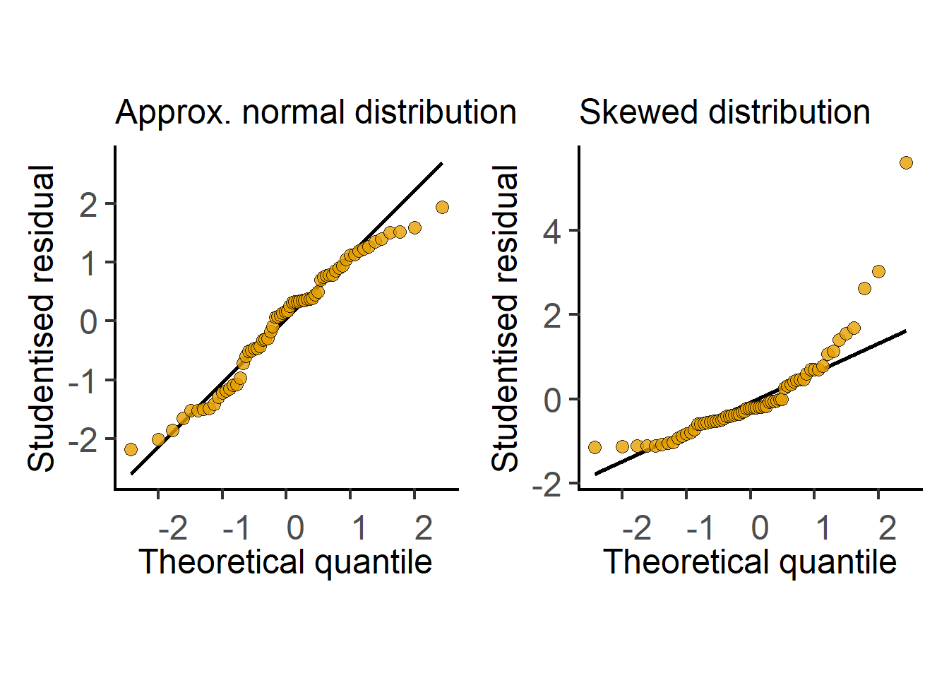
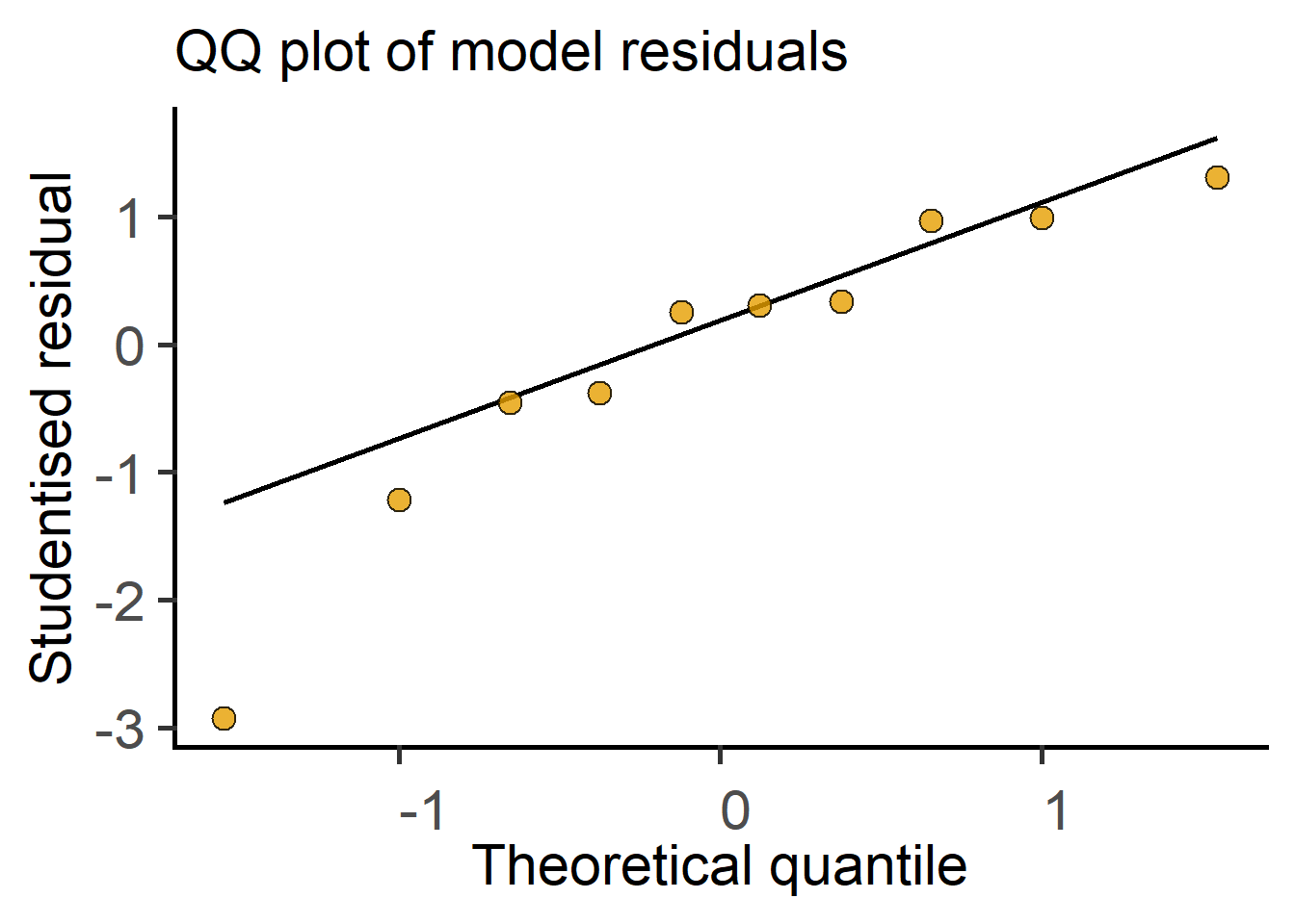
In the next section we see how t tests (and ANOVAs) are just linear models fit to data. Therefore, these tests perform better (i.e., are more reliable) if the residuals are small, normally distributed, and independent. Note that it is not the raw data – the residuals of the test should be at least approximately normally distributed. Therefore, after doing an ANOVA or Student’s t test it is good to check residuals on a QQ (observed Quantile vs predicted Quantile) plot. Conversely, if the residuals are skewed, this is a sign that the linear model (or the result of the Student’s t test or ANOVA) is a bad fit to data. Examples of approximately normal and skewed residuals are shown below in Figure 3.11.
3.10.2 t test & the straight line
In this section, we will see how a t test can be solved by fitting an OLS line to the data from two groups. The same principles apply when comparing more than two groups in one- or two-way ANOVAs (or factorial ANOVA in general) using linear mixed models discussed in the next section.
Recall that the t statistic is the \(signal/noise\) ratio i.e. difference between group means (mean\(_{WT}\) - mean\(_{\Delta mfg}\)) divided by the pooled or weighted SD of the two groups. Pooled SD is an average SD based on number of samples in each of the two groups (calculated using a straightforward formula). Here’s a worked example of the t test using the formula and the result from a conventional t test in here in Chapter 4.
Now let’s compare the doubling times of \(WT\) and \(\Delta mfg\) strains in a Studetn’s t test. In our example, we have \(n = 5\) doubling times for two strains, as in Table Table 3.1.
| Genotype | Doubling_time_min |
|---|---|
| WT | 18.5 |
| WT | 19.7 |
| WT | 19.8 |
| WT | 17.1 |
| WT | 21.0 |
| Δ mfg | 26.5 |
| Δ mfg | 30.9 |
| Δ mfg | 32.5 |
| Δ mfg | 29.4 |
| Δ mfg | 32.0 |
The data in Table 3.1 are plotted as boxplots in the graph on left in Figure 3.12. This graph yas a numeric Y axis and categorical X axis, which is the correct way of plotting factors. The \(\Delta mfg\) strain appears to have a higher doubling time. For these data, here is the result from a Student’s t test in R with the function t.test which we will encounter in Chapter 4.
    Two Sample t-test

data:  Doubling_time_min by Genotype
t = -8.717, df = 8, p-value = 2.342e-05
alternative hypothesis: true difference in means between group WT and group Δ mfg is not equal to 0
95 percent confidence interval:
 -13.960534  -8.119466
sample estimates:
   mean in group WT mean in group Δ mfg
              19.22               30.26
In the results, we see that the t statistic = -8.717, degrees of freedom = 8, and P value is 2.342e-05. The t statistic if the null hypothesis is true is 0, and -8.717 is a value far from 0 in the tails of a t distribution of Df 8. The output also includes the 95 % confidence interval, and the means of the two groups.

The way to obtain the t statistic with a linear model is shown in graph on right in Figure 3.12. To fit an OLS straight line through these data points, we do a small trick – we arbitrarily allocate \(WT\) and \(\Delta mfg\) X values of 0 and 1, respectively, so that we now have numeric X axis. The graph shows an OLS fit, which passes through the mean value of doubling time for both groups (this is how we will have equally spaced residuals above and below the line!).
This linear fit lets us do some tricks. The slope of a line is calculated as \(\frac{\Delta y}{\Delta x}\). Because we set the X values as 0 and 1, \(\Delta x\) = (1 - 0) = 1. You’ll notice that \(\Delta y\) is the difference between the two group means. So the slope of the line is just the difference in the means of the two groups, which is also the numerator of the t statistic or the \(signal\), as we saw in the section above. When the two means are the same (i.e., our null hypothesis \(H_0\)), the line joining the two means will be parallel to the X-axis with slope = 0.
For these data, residuals for are calculated by subtracting each value from the respective group means; the sum of squares of residuals is then used to find the OLS fit. Recall that the calculation of SD and variance also involves the same process of subtracting observed values from means and adding up their squares!
We can also calculate the standard error (SE) of the slope of the OLS line (here’s the formula), which is the same as the pooled SD calculated for a t test. This is the denominator or \(noise\) in the t statistic. Therefore, in a linear model, the ratio of the slope and the standard error of the slope of the line is the t statistic. We’ve just solved a Student’s t test as a linear model! If the slope of line \(\ne\) 0, the two means are not the same (alternate hypothesis \(H_{1}\)).
Technically, the linear model is the equation of the line that models (or predicts or fits or explains) our observed doubling time data. The linear equation explains the change in doubling time with Genotype, and predicts the doubling time when Genotype changes from \(WT\) to \(\Delta mfg\) (when we key in x = 0 or x = 1 for \(WT\) and \(\Delta mfg\) respectively in the \(y = mx + c + \epsilon\) equation). The error term \(\epsilon\) is a random positive or negative value depending on the SD of residuals with mean = 0. This is why it is important that residuals from the linear model are normally or approximately normally distributed. Plotting residuals of the model to check their distribution is therefore a good idea, for example a QQ plot. Here we arbitrarily chose WT as 0 on the X axis (R will do this in alphabetical order but this can be changed if needed), which made the values of the \(WT\) strain as the intercept on Y axis. If we had chosen \(\Delta mfg\) as X = 0,the sign of the t statistic will change and it’ll be in the other tail of the symmetric distribution.
As with linear fits, for t tests and ANOVAs to work well, residuals should be normally or nearly normally distributed.
Taken together, by fitting a line through two group means, where categorical/nominal factors were converted into dummy 0 and 1 for convenience, we got the slope and the SE of the slope, the ratio of which is the t statistic. The degrees of freedom are calculated from total numbers of samples as we discussed above, i.e., total number of samples – 2. We’ve just performed the t test as a linear model! R does this kind of stuff in a jiffy. You can see this in action in the result of t test as a linear model in here in Chapter 4.
Distribution of residuals
The residuals of linear models should be nearly or approximately normally distributed for the test result to be reliable.
Residuals can be normally distributed even when the original data are not normally distributed!
Skewed distribution of residuals suggests the model does not fit the data well and the result of the test will be unreliable.
Diagnostic plots of data and residuals, for example QQ or histogram plots, are therefore very useful. Simple data transformations can often improve the distribution of residuals and increase power of the test.
Like the conventional Student’s t test, conventional ANOVA calculations are done differently from linear models. However, linear models will give the same results for simple designs. ANOVAs as linear models are calculated with dummy 0 and 1 coding on X axis and sequentially finding slopes and SE of slopes. We see this in the next section, and Chapter 5.
In R, straight lines through X and Y points are fit using Y ~ X formula. Similarly, linear models for t tests and ANOVAs are defined by formula of the type Y ~ X, where Y is the quantitative (dependent) variable and X is the categorical (independent) variable. This is “read” as Y is predicted by X. R packages (e.g., lm() or lmer()) are popular for linear models and linear mixed effect models, where the data are passed on as Y ~ X formula where Y and X are replaced with names of variables from your data table.
3.10.3 Further reading on linear models
I am surprised we aren’t taught the close relation between t tests and ANOVAs and straight lines/linear models. There are excellent explanations of this on Stack: here, here, here and here.
This website by Jonas Kristoffer Lindeløv also has an excellent explanations of linear models.
3.11 Linear mixed effects models
A simple linear model is used when comparing independent groups where there is no hierarchy or matching in the data. In linear mixed effects models, intercepts and/or slopes of linked or matched or repeated observations can be analysed separately. Without getting into the mathematical details – this reduces \(noise\) in the \(signal/noise\) ratio and increases the F statistic, which makes it easier to detect differences between groups. For example, we can ask whether the slope of lines joining matched or linked data is consistent across experiments or individuals within a study (i.e., are the differences between group means consistent)?
Linear mixed model are very useful for the analysis of repeated measures (also called within-subject design), linked or matched data. As we will see in examples below, matched data do not necessarily come from the same individual or subject in all experimental scenarios. These kinds of data are often handled with the lme4 package in R, a version of which is also implemented in the [grafify] package; see Chapters 4, 5, 6 and 7).
So what does mixed stand for in mixed effects? It indicates that we have two kinds of factors that predict the outcome variable Y – fixed factors and random factors. Fixed factors are what we are interested in, e.g. “Genotype” within which here we have two or more levels (e.g. \(WT\), \(\Delta mfg\), \(\Delta yfg\)); “Treatment” (which may have “untreated”, “drug 1”, “drug 2” as levels); “Sex” of animals and so on. Conventional or simple ANOVAs and linear models (lm) only analyse fixed factors. Random factors are unique to mixed models, which we discuss next.
3.11.1 Random factors
What is a random factor? The answer to this question can vary and is best illustrated with examples. Random factors are a systematic ‘nuisance’ factors that do have an effect on observed values within groups but we are not interested in comparing them. If we can group them into a separate random factor, which enables us to reduce the total \(noise\) that contributes to the \(signal/noise\) ratio calculations for the factors that are of interest to us.
A common example of a random factor is “Experiment” – for example, if doubling times are measured for two Genotypes of E. coli (\(WT\) and \(\Delta mfg\)) in \(n = 5\) independent experiments, we could assign the noise across experiments to a random factor called “Experiment”. This will increase our ability to detect the signal that is of interest to us – whether the two genotypes have the same value for the variable being measured. We know that values for both \(WT\) and \(\Delta mfg\) doubling times change from experiment to experiment. But what we are interested in is whether the difference between the two strains is consistent across experiments. For example, whether \(\Delta mfg\) genotype has a doubling time that is consistently ~10 min larger than \(WT\) is typically more interesting to us even if the actual values across experiments vary, and sometimes they do vary a lot! This happens often in in vitro, in vivo, clinical and other experimental settings.
We saw in the above example of independent groups, that the linear model had a single intercept for \(WT\) which we fit into the \(y = mx + c + \epsilon\) equation. In mixed effects linear models, we can allow each level in the random factor (e.g. each “Experiment”) to have its own Y intercept. This way we compare whether slopes (recall that the slope of the line is the difference between the Y values with dummy X variables of 0 and 1) across”Experiment”. In other words, we ask whether the difference between the doubling times of the two genotypes we are interested in are consistent. The removal of noise originating from different values of doubling times within each genotype increases our \(signal/noise\) ratio and therefore the F statistic for the fixed factor Genotype.
Other example of a random factors are “Subjects” or “Individuals” or “Mice” in an experiment where we take repeated measurements of the same individual, e.g., measurements over time or before and after treatment with a drug. In such repeated-measures designs the “participants” are levels within the random factor “Subjects”. Each Subject could be allowed to have an intercept in the linear model.
The syntax in mixed models has an additional type of term: Y ~ X + (1|R), where X is the fixed factor and R is the random factor. (1|R) indicates we allow random intercepts (I won’t be discussing more complex models that allow random slopes (e.g. (X|R)) in this document). The syntax is simpler in grafify.
3.11.2 E. coli example for linear mixed effects
Let’s say we want to compare the doubling times of three strains of E. coli, i.e. \(WT\), \(\Delta mfg\) and \(\Delta yfg\). We performed six side-by-side experiments, which are plotted in Figure 3.14 (top left). As you see, there is a large variability between experiments, which is only apparent when data are plotted by matched experiments (top right). It looks like there may be a small, but noticeable, increase in doubling time of the \(\Delta mfg\) strain as compared to \(WT\) or \(\Delta yfg\). However, a conventional one-way ANOVA of these data gives us an F value of 1.4 (a rather small \(signal/noise\) ratio); with numDf 3 – 1 = 2 and DenDf = \(n-k\) = 18 – 3 = 15, the P value is 0.28, which is “not significant”.

However, when we plot each experiment separately, as shown in the panel of graphs below in Figure 3.14 (note different scales on Y for each graph), we can see that in all experiments \(\Delta mfg\) strain had a doubling time of 8-10 min more than the \(WT\) strain despite the different baseline levels of \(WT\) across experiments. We would have also noticed this difference in exploratory plots of differences and ratios between groups! The trend in our 6 experiments suggest that there is a consistent difference between \(WT\) and \(\Delta mfg\) despite the large variability within each genotype. This variance between experiments is assigned to the random factor “Experiment”. As you can see from the almost parallel lines across experiments, their slopes are similar. This means the difference between groups (\(\Delta y\)) is consistent irrespective of the absolute values.
The net result is a marked reduction in \(noise\) and a larger F ratio. The mixed effects analysis gives us an F of 9.33 with numDf = 3 – 1 = 2 and denDf = 18 – 3 – 5 = 10 (we lose Df for random factors; 6 – 1 = 5). This large F value is very unlikely by chance and has a P value of 0.005. You could conclude that the Genotype does predict the doubling time and different groups within the factor “Genotype” do not have the same mean. To find out whether different genotypes have different effects on doubling times, we will proceed to post-hoc comparisons between the genotypes (see Chapter 5).
This nicely exemplifies the power of linear mixed models in detecting small differences despite large experiment-to-experiment variability. Also see the section on Experimental Design on how to plan experiments to benefit from this kind of analysis.
3.11.3 Example of an experiment with mice
Let’s say we measure the level of a cytokine in the serum of 5 mice, each given placebo or a drug in 5 experiments (5 x 5 x 2 = 50 mice). “Experiment” can be a random factor here too, as different “batches” of mice or drug preparations may behave differently. Instead of ‘pooling’ data of all 25 mice per group, analysis with mixed effects will be more powerful. In fact, powerful enough that could reduce the number of mice per experiment! Indeed, with back-crossed strains of mice, given exactly same chow and kept in super-clean environments, we must ask ourselves whether each mouse is a biologically independent unit? Would you rather use a lot of mice in one experiment, or few mice spread across multiple experiments? Analysis of data from mouse experiments with mixed effects models is shown in Chapter 6).
3.11.4 Example of repeated measures
Variability within a group is easier to see from a clinical example involving studies on human subjects. Let’s say you want to find whether a new statin-like drug reduces serum cholesterol levels over time. You choose 25 random subjects and administer them placebo and measure cholesterol levels at week 1. Four weeks later the exact same individuals are given the drug for 1 week, after which we measure serum cholesterol levels for all individuals (more commonly called “Subjects”). Repeated-measures ANOVAs are also called within-subjects ANOVAs.
Here, “Treatment” is a fixed factor with two levels (placebo & drug). If we plot cholesterol levels for all 25 individuals in the placebo and drug group, the graph will look like the one on left in Figure 3.15.
“Subject” is a random factor as we have randomly sampled some of the many possible subjects. Each “Subject” is likely to have different baseline levels of serum cholesterol (i.e. different Y-intercepts). The variance (\(noise\)) within the ‘placebo’ or ‘drug’ group will therefore be very large. But we are not interested in the baseline level of cholesterol of our participants – we are interested in finding whether administering the drug leads to a difference of any magnitude regardless of, or in spite of, varying baselines. In this example, “Subject” is a random factor with 25 levels. The graph in the middle in Figure 3.15 shows lines that match Subjects (such graphs are also called before-after, matched or paired plots and are more informative when displaying matched data). You can now see that these lines joining the values for each Subject appear to have an overall negative slope despite different Y-intercepts. We “allow” each Subject their own intercept and compare all slopes and SE of slopes. The outcome of such analysis is it reduces variance within the groups we are interested in. In Chapter 7) we will perform a repeated-measures ANOVA using linear mixed effects modelling.

We can also allow each subject to have different slopes (i.e. magnitude of difference between placebo & drug on X axis). This may be necessary if there is evidence that individuals with a low baseline may have a “smaller” change with the drug and those with larger levels who may see “larger” change (or vice versa). Linear mixed effects offer a lot of flexibility in modelling observed scenarios. In this document we only consider models with random intercepts (different baselines). Refer to Further Reading for random slopes analyses.
Repeated sampling over time is quite common – whether with experiments with mice, model organisms or even in vitro experiments in multi-well cell culture plates, flasks of bacteria etc. The experimental unit (i.e. “Subject” or “Individual”) is assigned a random factor for repeated-measures analysis and “Time” is assigned as the fixed factor.
Extending the above example further, let’s say our 5 Subjects were recruited to 5 different hospitals (a-e) for “placebo” and “drug” treatments. This kind of a hierarchical or multi-level design can also be handled by mixed models as shown in the graph on right and bottom in Figure 3.15. It appears that Subjects at two hospitals do not show as much of an effect with the drug as compared to other three hospitals. Models can have as many random and fixed factors as supported by the data and experimental design – more complex linear mixed effects models are reliable only when there is sufficient data to fit them.
If values are missing (for instance, if one patient doesn’t turn up for a check-up!) the conventional ANOVA calculation will fail unless subjects with ‘missing values’ are completely excluded. This loss of data is avoided in linear mixed effects analysis as it will still compute the ANOVA with missing values.
3.11.5 Further reading on linear mixed effects
Here are websites by Gabriela Hajduk and Michael Clark with more further descriptions of mixed effects analyses. This visualisation of heirarchical data by Michael Freeman is also great.
3.12 Experimental design
The \(z\), t and F statistics will be larger and more extreme in the probability distribution if the \(signal\) is large and the \(noise\) is small. A larger value can be obtained if our experimental designs increase the \(signal\) and/or reduce the \(noise\). The \(signal\) is often an inherent biological property that we cannot increase or may have limited control over. For instance, the difference in the doubling time of the two strains (~10 min) possibly cannot be increased further unless we change experimental conditions (e.g. nutrient concentrations, temperature of incubation, shaker speed etc.). But this may not always be feasible or meaningful.
Reducing \(noise\) is usually possible with better experimental design and increased accuracy of measurements. The latter is obvious and depends on the experimental set-up (e.g., more technical replicates to increase accuracy of measurements), more sensitive and better equipment, and so on, and we will not discuss this further. We’ll discuss how better experimental design can help reduce the denominator that contributes to the \(noise\) term.
3.12.1 Randomised block design
Here randomised means that experimental units (e.g. Subjects, mice, LB flasks, culture wells etc.) are randomly assigned to treatment groups. “Block” denotes the random factor. These designs are also called split-plot designs. Randomisations ensures there is no bias in whether a particular mouse or patient is given placebo or drug, or whether any given LB flask receives \(WT\) or \(\Delta mfg\) E. coli. In a multi-well culture plate, which wells receive various treatments should be randomly assigned. Note that randomisation (i.e., randomised allocation to treatment groups) and random factors (i.e., Experiment or Subjects as discussed in the previous section) are distinct ideas. Randomised block design are analysed using mixed effects models (I don’t use Prism for such analyses as it doesn’t work!).
The idea of split-plot designs are easy to understand from an agriculture–related example. If you are testing the impact of 5 fertilizers on a crop and you have 5 plots of land in geographically different locations to do it on, the best design is to split each piece of land into 5 split-plots to administer each fertilizer. Which fertilizer is applied to a split-plot should be decided randomly. This design lets you control for unknown factors that affect plant growth (e.g. soil quality, hydration, sunlight, wind etc. at the geographical locations). The geographical locations could affect the baseline level of growth of the crop which we are not interested in – we want to know whether a fertilizer makes a difference irrespective of baseline growth rates across plots of land. Variability across plots is assigned to the random factor or the “blocking” factor and we focus on comparing differences between fertilizers in split-plots at each location. By testing all 5 fertilizers at all 5 plots of land, we reduce within group \(noise\) and increase \(signal\).
Examples of block designs are shown in Figure 3.16. In A is an example of side-by-side experiments on 3 drugs and control set up as technical quadruplicates (4 wells per treatment) placed “randomly” (although this could be done better than my depiction of it!) in a 96-well plate. Each experiment will generate a mean of technical replicates and 5 means for each treatment from 5 experiments will be compared statistically. If we use all technical replicates in our analyses this will lead to pseudoreplication with 4 x 5 = 20 values that artificially increase denDf – this is wrong!
In B, one mouse each of four strains of mice are either “control” or “treated” in two experimental blocks. By reducing the number of mice per group per experiment, this satisfies the principles of 3R as described further in this manuscript by Michael Festing [1]. Analysis of data from this paper is shown in Chapter 6) (and is not possible in Prism as far as I know).
Returning to microbiology, our above E. coli doubling times measured side-by-side analysed by mixed models reduced within Genotype variability. Here the “Experiment” is the block or plot, and each plot is split into 3 for our 3 strains, and flasks of LB should be assigned randomly to each strain. We may also choose to measure each strain in technical replicates, flasks for which should also be randomly assigned. Unknowns in a given experiment (e.g., autoclave cycle, shaker speed, temperature etc.) will affect all 3 strains on a given day similarly, and mixed models analysis will help identify trends between Genotypes across experiments.
Randomised blocks
It is quite common to perform experiments side-by-side in block designs, but few of us are familiar with mixed effects analysis that are powerful for analysis of such designs. R packages lmer and nlme, among others, can be used for this. An easy version of lmer is implemented in grafify with a simple user interface.
3.13 Technical versus Biologically independent replicates
Typically, we are interested in determining the inherent biological variability in our system and not our technical accuracy in making measurements. This is where the term biologically independent arises from – remember the examples of polling surveys (same households?) and clinical trials (diverse patients and controls?).
The framework of probability distributions underlying statistical comparisons requires that our sampling from the true population be independent and representative. Technical replicates improve the accuracy of our measurements, but they do not reflect the scatter of the true population and are not independent samples. Biological independence is typically seen when laboratory experiments are set up on completely different occasions with independent sources of biological materials. These could be bacterial colonies, starting cultures, cell lines, primary cells, mice, PBMC donors, and so on. Simply because you have two bacterial cultures or individuals or mice does not mean that they are representative and independent samples of the population!
We previously thought of independent E. coli doubling time experiments as drawing numbers from a big bag – technical replicates would be reading each number 3 times; because you re-read it 3 times does not mean \(n=3\)! You should not use these values for statistical comparisons. Technical replicates account for pipetting variability, for example when preparing dilutions, density of cells plated for experiments, differences in cuvettes used for optical density measurements, ELISA standard curves and sample addition to wells, and so on. Multiple wells of a cell culture plate or bacterial flasks account for pipetting errors that can result in different numbers of cells across wells or flasks – different wells or flasks may not statistically independent even if biologically different depending on the experimental unit of measurement. Sometimes replicates are used just as “insurance” in case something goes wrong! What matters is not the number of technical replicates, but the quality of technical replicates.
The average (e.g., mean) of technical replicates from independent experiments should be used for statistical comparisons. Statistics on technical replicates within an experiment is not valid because such observations do not satisfy the assumptions of distributions. Consider the examples listed below that may appear to be independent replicates but may require further thought based on the quantity/variable being measured:
Two flasks of LB inoculated with the same preinoculum of E. coli to measure doubling times – even though there are two separate flasks, they technical replicates because they received the same starting bacterial culture. The two flasks are not independent, representative samples the true population.
Same bacterial culture used for MIC experiments in duplicate or more replicates.
Tissue culture cell lines plated in multiple wells in duplicates/triplicates – the two/three wells are technical replicates in the experiment. They originated from the same culture dish, were plated in the same cell culture medium and will respond similarly to any perturbations such as infection, cytokine or drug treatments etc. that are measured at the level of the whole well (“same household” in the polling survey). A completely independent source of cells i.e., typically an experiment performed on a different day, different passage of cells, different culture dish, would be independent and reflect the underlying biological variability that captures the true population value we are estimating by accurate, independent sampling. See Figure 3.17.
Primary cells prepared from the same mouse and plated in multi-well culture plates would also be technical replicates depending on the quantity being measured. Cells prepared from different mice or different human donors/patients could be independent.
If your experiment involves two biological systems, e.g. infection of eukaryotic cells or mice with a bacterial pathogen, independent experiments should use completely independent batches/sources of both the host (cell lines, mice, patients etc.) and pathogen on different occasions (bacteria from different colonies, newly streaked out agar plates etc.).
Statistically independent observations
Laboratory-based in vitro experiments are typically independent when the whole experiment is performed on different occasions with completely different starting biological materials, including bacterial cultures, cell lines, primary cells, mice etc.
Depending on the experimental setup, two individuals, mice, bacterial cultures may not necessarily be independent samples of the true population.
The average of all technical replicates is the measured value of the parameter from that experiment.
When writing Methods, you should clearly describe how many times you performed the experiment independently on different occasions because “biological independent” is often a confusing term. Statistical tests should not be performed on technical replicates of a single experiment because they violate the requirement of independent sampling – technical replicates should only be used to calculate average values for that experiment and compared to independent averages (see Figure 3.17 above). Technical replicates used in statistical comparisons lead to a what is called pseudo-replication, which we discuss next.
3.13.1 Pseudo-replicates
The t and F distributions look up a given statistical comparison based on the number of independent samples drawn from the true populations (numDf and denDf). The critical cut-off values for P < 0.05 will change if the software looks up the wrong distribution family! The higher the Df (more samples), the lower the cut-off values will be (critical values for \(z\) are \(\pm 1.96\)). R (or other software) will use all data in the table and calculate degrees of freedom. The software assumes that the data entered are representative and independent! If you also use technical replicates of experiments in the data table, the software will think there are more ‘values’ and look up the wrong t or F distributions and generate incorrect, lower P values. The result of the test might appear as though the differences you observed as less likely by chance than they actually are (false-positive result)!
Beware pseudoreplications
Pseudo-replicates are non-independent values that have been incorrectly used in statistical comparisons when they shouldn’t be – they are not mathematically or statistically independent and do not satisfy the assumptions of sample probability distributions.
Going by the polling analogy, this would be akin to asking the opinions of all members of the same family or close friends who share common opinions that are not representative of the true population.
Only you – the experimentalist who designed the study – will be in a position to definitively answer the questions below that can help you figure out whether you are dealing with pseudo-replicates. Ask yourself what is the experimental unit? Are you measuring a parameter at the level of a population in a tissue culture well or bacterial culture flask or tube? Are you measuring a pooled measure in a field of view in microscopy or populations in flow cytometry? Are you measuring a quantity at the level of every bacterium individually (e.g., single-cell measurements)? Are you measuring single molecules?
Microscopy: are individual cells on a cover-slip “independent” in microscopy experiments? This could depend on the quantity being measured – are you measuring hundreds of cells in a field and generating a summary value such as the “percentage” of cells +ve for an ‘event’? If so, you have already “used up” the data on hundreds of cells to generate one quantity and should lose degrees of freedom. The 100s of cells are not really providing you with 100s of different numbers! On the other hand, if you are measuring fluorescence intensity of a marker on 100s of cells and presenting each intensity separately, you could consider each cell as an experimental unit. However, you should ask yourself is it enough to measure 100s of cells in one experiment or should we repeat this experiment independently multiple times? You should indeed measure 100s of cells in biologically independent experiments. Hierarchical data like these can be analysed using mixed models, which is what most of this document focuses on and the package
grafifycan do.Flow cytometry: in flow cytometry even though parameters for each cell are counted individually, quantities are often expressed as % populations. You’ve “used up” values from many cells to generate one % value and lost degrees of freedom. Percentages of populations from independent repeats should be generated for comparisons (i.e., from experiments on different days, different mice, different batch of cells etc.).
subcellular organelles/bacteria may or may not be independent, too. Is each bacterium within a host cell an experimental unit? It could be depending on what quantity you are measuring and how you express it. Heterogeneity in gene expression could result in different bacterial cells interacting differently within a single host cell – with the right experimental design you can measure cell-to-cell differences within a population of bacteria or subcellular organelles within a cell.
single-molecule experiments: are observations on individual molecules in the same cell independent? How many should you measure? How many biological/biochemical independent experiments should you perform?
tissues from mice: are multiple measurements on the same tissue within a mouse independent? If you make a measurement on each lobe of the lung or liver, are they independent? How? Why? If you took 3 measurements on the liver of 3 mice, how many independent observations do you have? If you repeated this on another day with another 3 mice, how many independent observations do you now have?
Hierarchical experimental designs, for example where we have 50 single-cell measurements from in five independent experiments, can be analysed using mixed effects models which we discussed above.
3.14 Data analysis pointers
Tip
If you have collected data, just go ahead and plot the data! Plotting raw data, eye-balling it, exploratory data-fitting and analyses are highly recommended regardless of what you think has happened while collecting data in your laboratory experiments.
3.14.1 Normalisation
Normalisation within an experiment is usually done to calculate fold-change over a “control”. This may involve dividing all groups with the “control” or “untreated” group and obtaining ratios as fold-change or percentages. Once this is done, all control or untreated values will be the same (i.e. 1 or 100%) and have an SD of 0! No other group should be compared to this group as it has no SD and violates the assumptions of the normal probability distribution. Instead, normalised data should be analysed with the one-sample t test. This test asks whether the observed value (e.g. your ratio \(\pm\) SD across experiments) is equal to a defined value, e.g. 1 (for fold-change) or 100 (for percentages). Although not apparent initially, normalised data are actually pairs as they are ratios of two observed values. Degrees of freedom will depend on number of pairs or ratios being compared and not total number of values in the groups. Indeed, a paired t test is essentially a one-sample t test!
Alternatively, you could use linear mixed models, which allow different baselines, and avoid normalisation.
3.14.2 Data transformation
After performing a Student’s t tests or ANOVA, if the residuals are very skewed and not even approximately normally distributed, simple transformations of the raw data may be useful. Data transformations may make residuals to be normally or nearly normally distributed. Commonly used translations are: log (to any base), \(logit\), squares, square-roots.
Residual distribution can be checked with the Shapiro-Wilk test, however, this can be unreliable when the number of samples \(n\) is either too small or too large. A QQ plot or histogram is often a good visual check of normality of residuals. Sometimes, the inherent property of the variable being measured may help decide whether data transformation would be appropriate, e.g., when distributions from previous experiments are known.
3.14.2.1 Percentages and probabilities
Percentages and probabilities have hard lower and upper limits: 0 and 100 for percentages and 0 and 1 for probabilities. Observed values close to the lower (0) or upper (1 or 100) limits will not be symmetrically distributed about the mean because at these “walls” data are ‘clipped’ (i.e., only one side of the normal distribution). For example, values of mean 95% with an SD of 5% are unlikely to be normally distributed because >100% is not meaningful. The same is true near 0. This can be remedied with \(logit\) transformation, which is a the log of the odds ratio i.e., \(log(\frac{p}{1-p}\)). For values close to the upper or lower limits, try \(logit\)-transformations (only possible for positive values between 0 and 1; percentages should be first divided by 100 to use this transformation).
3.14.2.2 Log-normal distribution
Values in microbiology and immunology, and biology in general, can often vary as fold-changes, proportions or log-orders of magnitude. For example when measuring the kill-curve of an antibiotic over time, we may observe 10-, 100-, 1000- fold killing over time. These changes in colony forming units (CFU) are changing exponentially to the power of 10. This just means that the log of these numbers are normally distributed and we should perform statistical comparisons on log-transformed data.
Exponential changes in values are also common in gene expression data such as RT-qPCR, which is essentially doubling of DNA per cycle i.e. increasing by power of 2. Log to the base 2 is often calculated for differential gene expression to bring their distribution closer to the normal distribution. Statistical comparisons are then performed on log-transformed data. Obviously, if you need to report mean \(\pm\) SD, they should be on the original scale by an appropriate back-transformation.
log-normal distribution
Paired-ratio tests or \(log_{10}\)-transformations will fail when you have zero or negative values.
Results will be on log10-scale and need to be back-transformed (\(10^{x}\)) so you report mean, SD, \(CI_{95}\) etc. on the original scale.
3.14.2.3 Ratios versus Differences
Exploratory plots of data such as by subtractions of means to find difference between groups or plotting their ratios can tell us how groups differ from each other. This is why exploring and eye-balling data is very important. Sometimes we may know this from previous experiments.
It is common in biology for parameters to vary as fold-changes, i.e., as multiples of various factors (some known and some unknown). For example, the level of cytokines in serum upon infection of a mouse may depend on dose of pathogen times the virulence gene expression times the influx of myeloid cells times microbiome times unknown factors, and so on. Similar effects operate in vitro, where the confluency of a cell line, multiplicity of infection, cell culture medium and various other parameters may influence cytokine production. Such values will be log-normally distributed.
Let’s consider the following two scenarios of a new antimicrobial drug. Consider the first case where we measured doubling time of E. coli in the absence or presence of the drug on 4 different occasions. Our doubling times varied markedly between experiments – 20, 40, 50 and 80 min – but in all experiments the presence of the drug led to slower growth and increase in doubling time by approximately by 20 min. Despite the variability, the difference between control and antibiotic treated samples is consistently ~ 20 min. Recall that a Student’s t test calculates differences by subtracting group means (and an F test calculates the differences by subtracting values from overall means to calculate variances between groups). So these are only appropriate when the difference between is consistent (e.g., subtraction of two means is consistent).
Now consider a second antibiotic which we find increases the doubling time in all four experiments by 5-fold. Meaning, that the doubling times in the presence of the drug are approximately 100, 200, 250 and 400 min, respectively (again, we would suspect this by plotting graphs of differences and ratios of the means in the presence and absence of the antibiotic). You’ll note that now the proportion is consistent (and not the difference) and the t or F statistic will have a large \(noise\).
In such cases, where fold-changes are involved, we can use the properties of logarithms to perform statistical tests. Mathematically, the log of a ratio of two numbers is same as the difference between the log of the two numbers.
\(log (\frac{100}{20})\) = \(log100 - log20\) = 2 - 1.3 = 0.7 (I have used base 10) and anti-log of 0.7 (\(10^{0.7}\)) = 5
Whether the ratio 100 min/ 20 min = 5 is consistent can be tested by performing the statistical tests on log-transformed values!
So when data vary as fold-changes or ratios or exponents, consider statistical comparisons of log-transformed data. Remember to back-transform log values to the original scale when reporting results. However, also keep in mind that log(mean of data values) \(\ne\) mean of log(data values). Let that sink in!
3.15 Power analysis
Power analysis is used to determine the minimum sample size for a study so that we can detect a difference in a variable of interest of a magnitude that is biologically meaningful at a defined \(\alpha\) threshold. The magnitude of interest is not a statistical question – it is determined by us scientists based on our understanding of the biology, clinical features, feasibility, resources etc. Typically, the desired power of a study is at least 80 % – which means 8 out of 10 independently repeated studies should find the same result. Power depends on many factors, most importantly on the sampling distributions, which we discuss in this section.
3.15.1 Sample sizes and distributions
We previously considered the theoretical population of all E. coli doubling times with a mean of 20 min with an SD of 2 min for \(WT\) bacteria. Let’s assume that the strain \(\Delta mfg\) has a doubling time of 25 min and SD of 2 min. Power analysis helps us design experiments to ensure that we can reproducibly detect this small difference in doubling time (5 min) between the two strains. Recall that we also considered the example of 10 studies of size \(n = 3\) where not every student could find the true population doubling time of 20 min.
To design the experiment to compare the doubling times of these two strains with sufficient power – that is to ensure it is reproducible, let’s first us see how sample size \(n\) affects the sample mean and standard deviation. We generate 25 simulated results of such a “study” with two sample sizes per group: \(n = 3\) (low sample size) and \(n = 15\) (large sample size) from the population distributions of \(WT\) and \(\Delta mfg\) strains (with the function rnorm in R which just needs the mean and SD to provide random samples from the normal distribution). The means and standard deviations of 25 such simulations, each with a sample size \(n = 3\) or \(n = 15\), are shown in Figure 3.18. The graphs reveal that the spread of means as well as SD is larger when the sample size is smaller, and the spread is lesser when the sample size is larger. In other words, repeated experiments of \(n = 3\) we are less likely to reproducibly find the same mean and SD for the populations – this is because we may observe “statistical flukes” of large differences between the means of the two groups and a small SD. For instance, a “fluke” high mean for the \(WT\) and a low mean for the \(\Delta mfg\) could give us a Student’s t test result with a small “fluky” P value for that one experiment of size \(n = 3\), but it would be an unreliable and non-reproducible result.

The finding depicted in Figure 3.18 is somewhat intuitive: if we draw a larger number of independent, accurate samples we are more likely to find the true population parameters. Power analyses allows us calculate the minimum sample size so that 80 % (typical level of power) of repeated studies will find the same result at the defined significance threshold (typically \(\alpha\) = 0.05).
3.15.2 Power & error rates
Power of a study is linked to the significance threshold \(\alpha\), which is the threshold at which we define critical values of a distribution beyond which we find outliers. Note that even though these values do truly belong to that distribution we reject them as outliers, therefore \(\alpha\) is also called the false-positive error rate.
A false-positive or Type I error occurs when we assume something is true when in reality it is false (e.g., when we reject the null hypothesis when in reality it is true; we think the two group means are different when in reality they are not; we tell a patient something is wrong with them when everything is OK). Typically, \(\alpha\) level is desired as low as possible. However, it this is also connected to the false-negative error rate and power.
A false-negative or Type II error (\(\beta\)) occurs when we assume something is false when in reality it is true (e.g., when we fail to reject the null hypothesis when in reality it is false; when we think the two group means are the same when in reality they are not; we tell a patient everything is OK when they might be sick!). By convention, the desired Type II error rate \(\beta\) is set at 0.2. Power is defined as \(1 - \beta\); so desired power of a study is typically 0.8.
The connection between power, \(\alpha\), \(\beta\) and sample distributions is illustrated in Figure 3.19. Unlike the true population distribution (which is fixed), the parameters of sampling distributions (e.g., mean and SD) can change with the sample size (and of course, the accuracy of our experiments!).
The graphs in Figure 3.19 show the the sampling distributions of the doubling times of \(WT\) (mean 20 min) and \(\Delta mfg\) (mean = 25 min) when the SD is 2 (a higher sample size \(n = 15\)) or 4 (smaller sample size \(n = 3\)). The tails of the distribution at thresholds \(\alpha/2\) are labelled for a two-tailed hypothesis that the means of the two genotypes are not the same. With a smaller sample size and larger SD, the overlap between the two distributions is larger, leading to reduced power of the experiment. This is because the region of the distribution of \(\Delta mfg\) that separates from that of \(WT\) at the \(\alpha\) threshold has reduced. In our experimental design, what this is means is that because of wider shapes of sampling distributions, we will not be able to detect small differences in group means with a small sample size.

3.15.3 Sample size & confidence intervals
The connection between power and sample size can also be seen from confidence intervals. We saw above that \(CI_{95}\) is a multiple of the SEM, which in turn is \(SD/ \sqrt n\) . Because \(CI_{95}\) depends on sample size \(n\), we can do the reverse calculation to estimate the sample size needed to obtain an interval not larger than a desired size. Recall that:
\(CI_{95}\) \(= mean\) \(\pm\) \(z\) x \(SD/\sqrt n\).
The error margin can be defined as:
E = \(z\) x \(SD/\sqrt n\).
Rearranging this we can get sample size \(n\) = \((z\) \(SD/E)^2\)
The following page from Lisa Sullivan at Boston University School of Public Health is easy to follow and with simple worked out examples.
Like in all power calculation, what the value of E to use is up to the scientist – this is not a statistical question. The difference we want to be able to detect between groups is based on what is a clinical or biologically meaningful or feasibile (e.g., time, cost, resources etc.).
3.15.4 Calculating power
For simple cases such as two groups (various types of t tests) the sample size can be calculated with the R package pwr [2] or software Gpower. Examples are shown in Chapter 8.
GPower
Power analysis should be performed before starting large experiments. Post-hoc power analysis should not be done to find the power of a study that’s been completed.
Gpower is a free programme that will carry out power analysis for most simple designs.
When analysing more than two groups, especially mixed models with random factors, power is more accurately calculated by simulation than from effect sizes. What this means is the following: once we have an estimated \(noise\) (SDs) and \(signal\) we are interested in detecting, R is used to simulate data thousands of times at varying sample sizes, and the proportion of those generating P \(\le\) \(\alpha\) threshold at each sample size is calculated; the sample size \(n\) that has P \(\le\) \(\alpha\) in 80% of simulated data is the sample size to use for the main study. Typically, the sample size is then inflated by a further 10-20 % to account for experimental errors or, in case of clinical studies, individuals who might drop out before the study is complete. This is the preferred way to determine power for mixed models in R by simulating the whole experimental design, for example, using the simr package [3].
Work with live animals requires power analysis for planning reproducible experiments. The idea is that findings form work with animals should be statistically reproducible at least 80 % of the time to avoid wastage of animals, resources, time etc. Designs should use the fewest but necessary number of animals that achieve statistically significant (typically P \(\le\) \(\alpha\)) results at 80 % power. This avoids the use of animals in under powered studies that would not be reproducible. Same applies for clinical studies with human volunteers and patients, and should be decided before starting the study.
There’s another requirement in frequentist analysis: once the sample size is decided, P values should not be calculated until the whole study is finished (i.e., all participants are recruited and analysed, or all experiments are completed \(n\) number of times). No sneak-peeks at P values before completing the full study!